Topple a Statue of King George at MCNY's New Revolutionary Exhibit
Explore the seven years of NYC history when the city was occupied, brutalized, and eventually, liberated.


Yesterday, the New York City Department of Health released COVID-19 coronavirus testing data by zip code on GitHub, the repository of data and code for nerds. Untapped New York contributor Ben Huff, who is a Master of Science graduate in Urban Planning from Columbia University Graduate School of Architecture, Planning, and Preservation (GSAPP), created this interactive map using that data for us by layering the zip code shape file from NYC Open Data with the DOH data.
Using this map, you can see the comparative number of cases by zip code, with lighter colors having fewer cases and darker colors more. Click on a zip code area, and you get a pop-up that shows the number of tests, the number of positive cases, and the total population.
Some notes: Williamsburg zip code 11249 is missing from the Github data file, so it only looks like it has few cases. The data is also limited by access to testing by zip code — areas may have more cases because more people can be tested, but may not mean there are actually more cases. Until widespread testing is available and the data set is complete following the crisis, the true picture of what is happening by neighborhood cannot be assessed. And even at that point, we may never know the full number of cases.
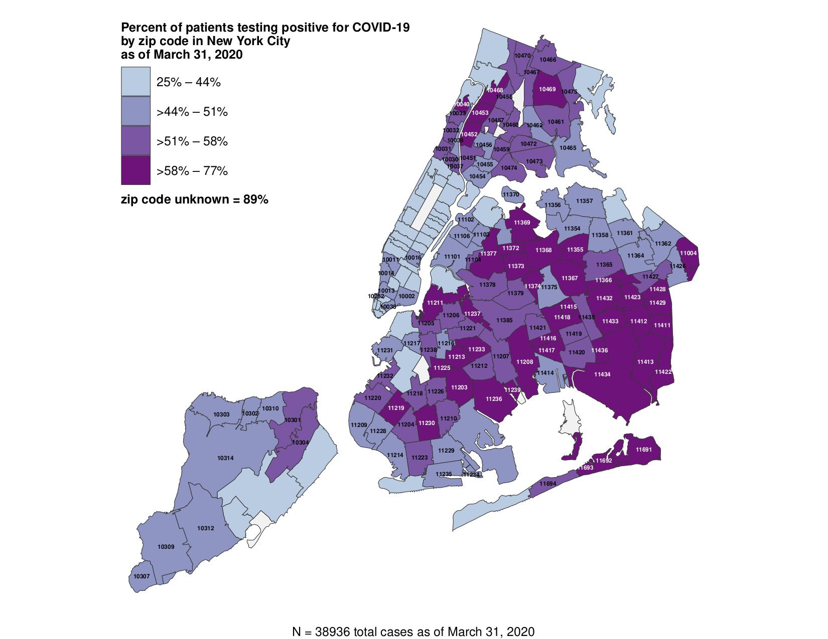
Here is a Department of Health map showing percentage of patients testing positive by zip code (which does show Williamsburg). The zip code unknown percentage at 89% seems like a red flag however.

Source: NYC Department of Health
We would also have to do further analysis using socioeconomic data to determine whether there is a true correlation between income and coronavirus incidence (as well as mapping per capita), but at first glance you are seeing higher number of cases in the far outer boroughs. In The New York Times‘ own analysis of the same data, they write, “many of the neighborhoods with the most confirmed virus cases were in areas with the lowest median incomes, the data shows.”
As Ben Wellington from I Quant NY mapped on March 18th, the ridership drop in the subway was far less extreme in less affluent neighborhoods. He wrote, “What’s troubling is that this may mean an additional health burden on those who may have less access to quality healthcare and are less likely to have paid sick time (or a security blanket for lost income). The health risks of keeping the subway open are not evenly distributed among income groups.”
We have made this map from open source data and produced it in a form that is embeddable you can use this code below. Please just give credit to Ben Huff/Untapped New York:
<iframe src=”https://bhuffs.carto.com/builder/38c2f85e-02df-46ab-8266-37a8391ede4d/embed” width=”100%” height=”760″ frameborder=”0″ allowfullscreen=”allowfullscreen”><span data-mce-type=”bookmark” style=”display: inline-block; width: 0px; overflow: hidden; line-height: 0;” class=”mce_SELRES_start”></span></iframe>
Next, check out our complete coverage of coronavirus in New York City including a look inside the Central Park field hospital. Check out 12 groundbreaking hospitals that have closed in NYC.
Subscribe to our free newsletter